Phoenix Dashboard
Data Visualisation | Web Development | Service Design
Background & Opportunity
The CICS development team produces thousands of tests results a day. Developers and testers need to quickly solve problems and product managers need to quickly assess the overall health of the product. This project was commissioned as there was no central hub to access the test results in order to analyse trends in a visual way. The team was made up of a project sponsor, an architect and two developers. I was the Front-End Developer on this project.
Observe - define and discover
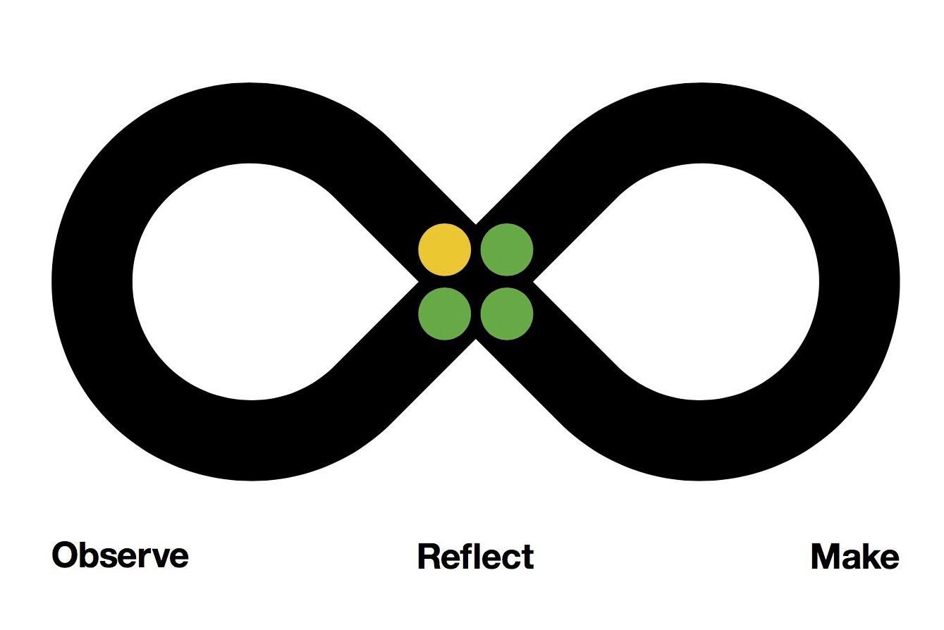
The IBM Design Loop was at the core of this project, so the first step was to define and discover
the current situation and problem. This was done by carrying out 1-1 interviews with various
members of the department who are involved with the testing process. We decided to focus on two
user personas - the manager and the tester. The full persona profiles included stakeholder maps,
breakdowns of user flows and behaviour patterns.
Once these sponsor users were defined, more interviews were carried out and I sometimes
sat with the users to see their current processes. You can learn a lot by watching how people
work! This process drew out some key limitations of the current system and we decided to improve
each one with a feature.
- Users can only see one test at a time
- Slow and lots of downtime
- Testers can't see tests only relevant to them
- No data analytics of tests
- Need to use various different tools to gather information
- Overviews of test results
- Web app, use AJAX to only pull data that's needed
- Collections - users able to group relevant tests
- Insights Page with analytics and patterns
- Key information about tests in one tool
Reflect - prototyping + design validation
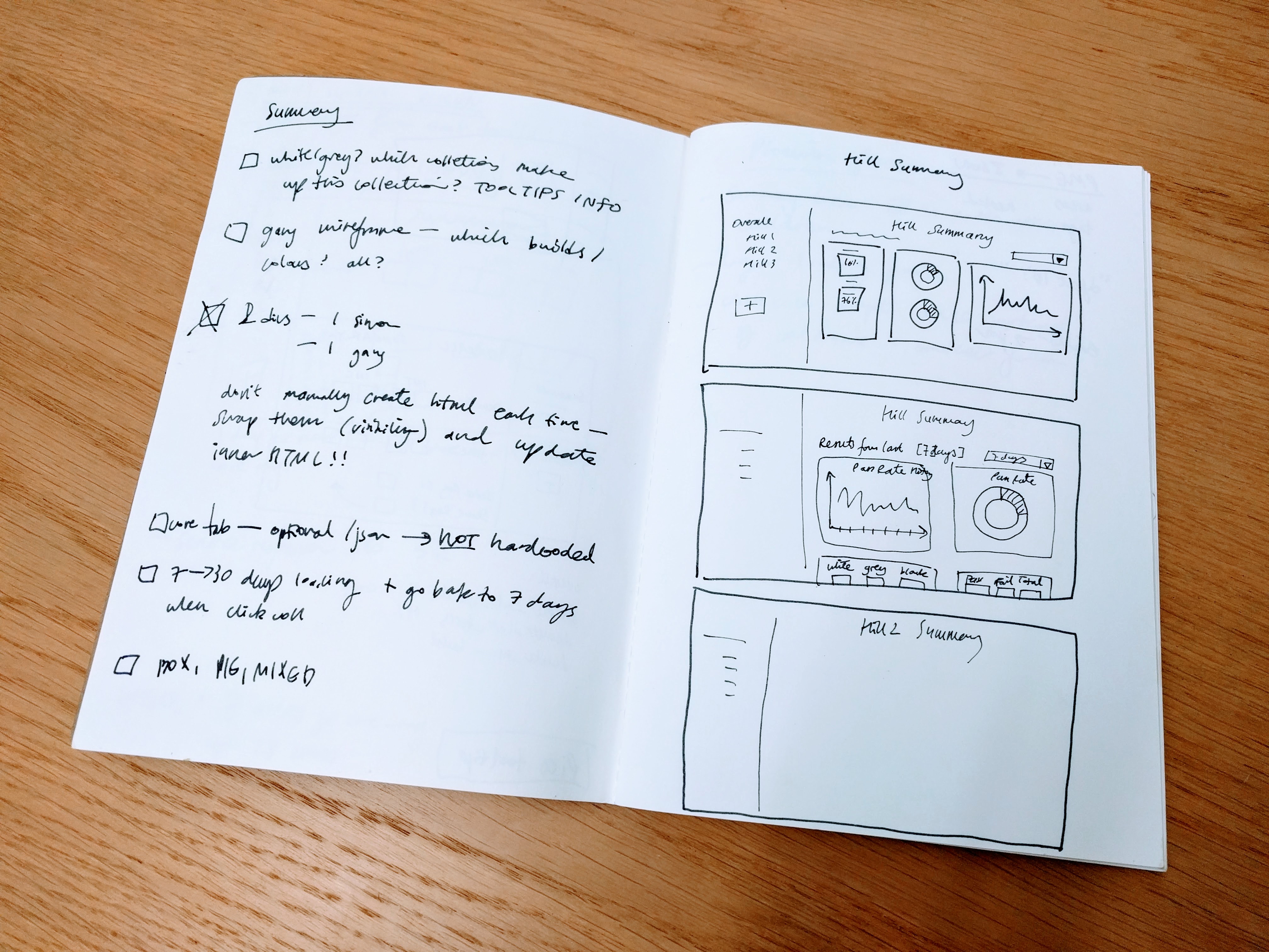
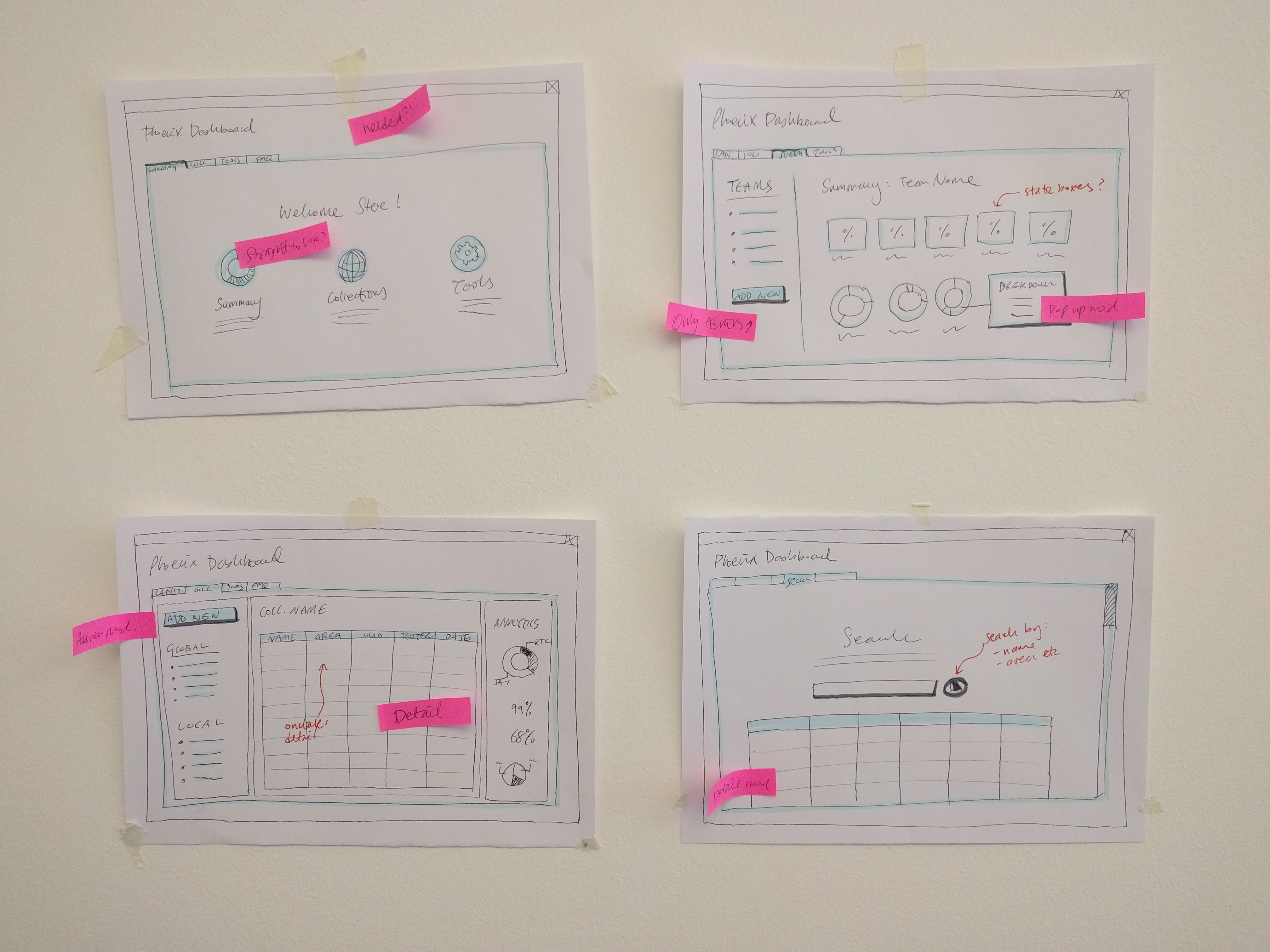
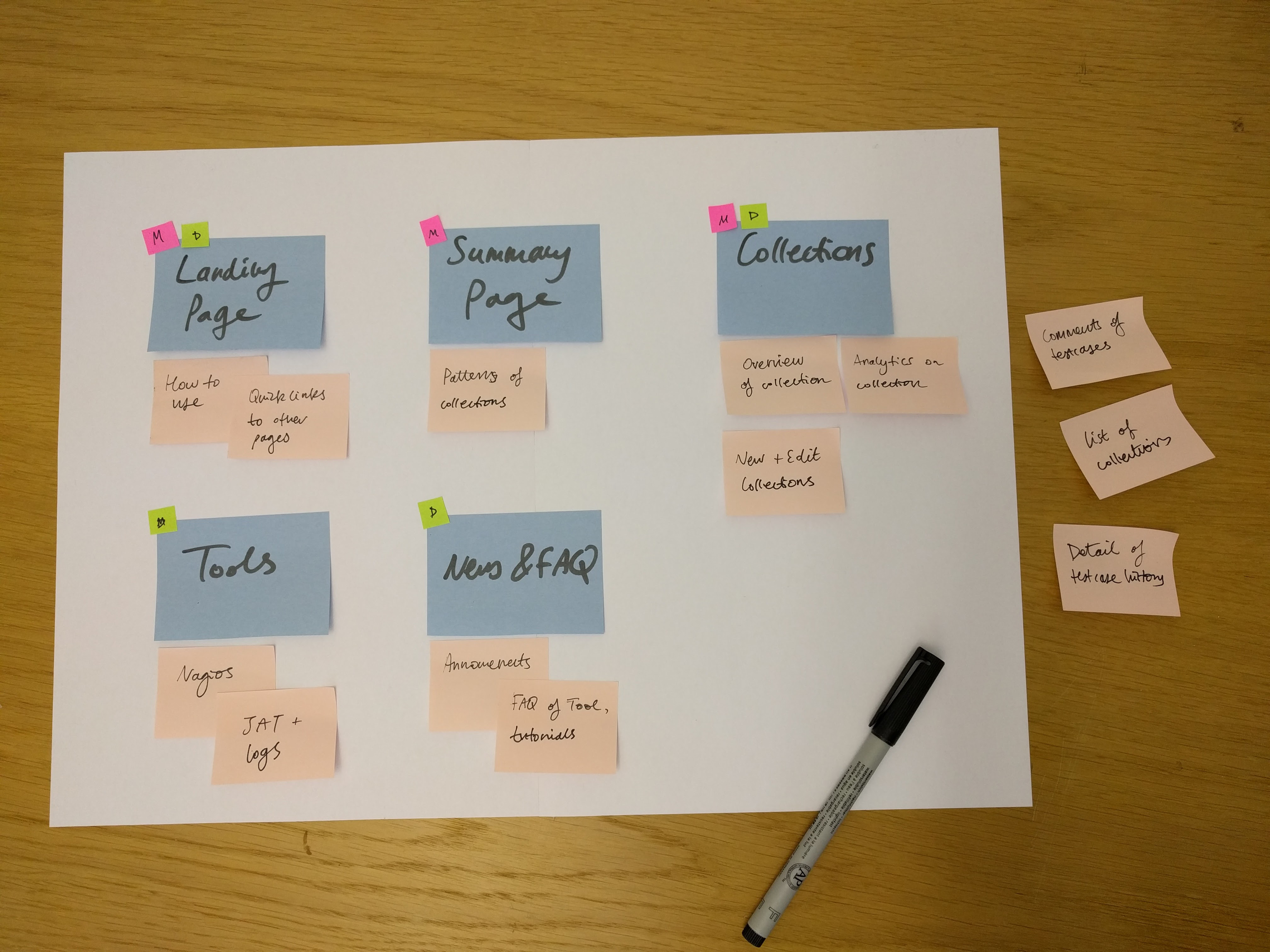
Now that the high-level features were defined, it’s time to prototype! Various methods were used
to find the best user flow and User Interface. Paper wireframes, card sorting, playbacks with
the users and stakeholders were vital for gathering rapid feedback on the initial design of the
dashboard.
Although this step took some careful planning and time, it was really important to fail
fast at this stage. Completely changing the structure and elements of the dashboard takes minutes
using paper - this is peanuts compared to changing it in the code further down the project! The
playbacks to the team were especially useful as they not only aligned the stakeholders and users
of the project, but other colleagues who were not involved with the project had a chance to give
useful feedback on their thoughts.
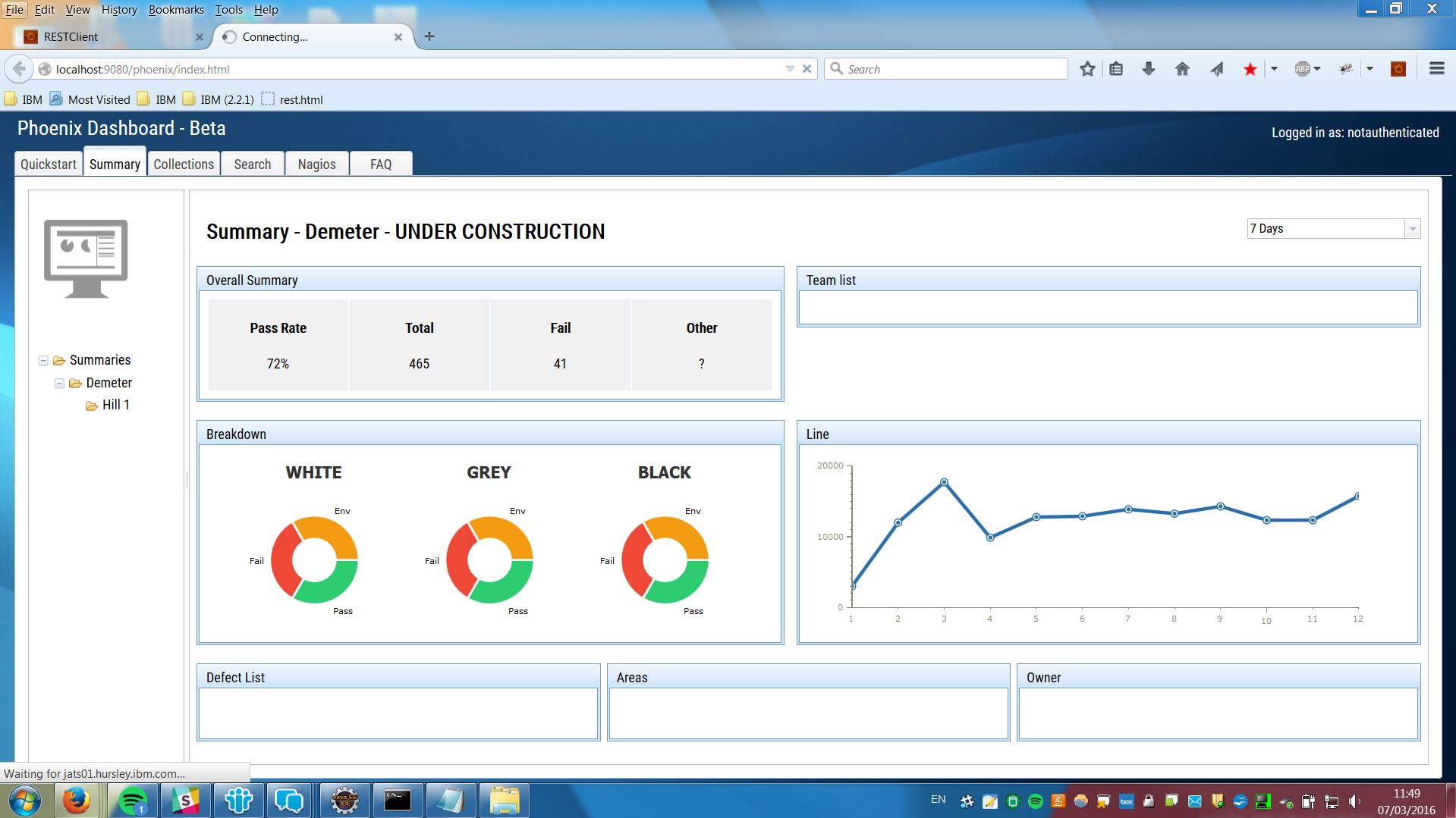
Make - Let’s get coding!
The back-end APIs were written in Java and I wrote the front-end code that created the User Interface
using HTML5, CSS JavaScript and jQuery. The dashboard was created using the Dojo framework and
using mongoDB to store the data. We decided to put all features of the dashboard e.g. summary,
categories and the detailed results on one webpage to provide a seamless experience for the user.
To make the dashboard would load as fast as possible, it would only load in data when it’s needed
using ajax functions.
The work was played back continuously to the stakeholders and users to get feedback.
Each iteration built upon the prototype which used a dummy set of data to simulate the real test
data. Some key examples of feedback based changes include the football score style results, summary
box categories, collection edit functions and the search functionality.
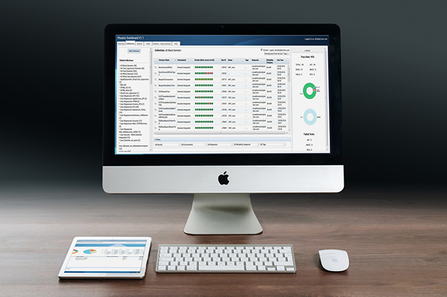
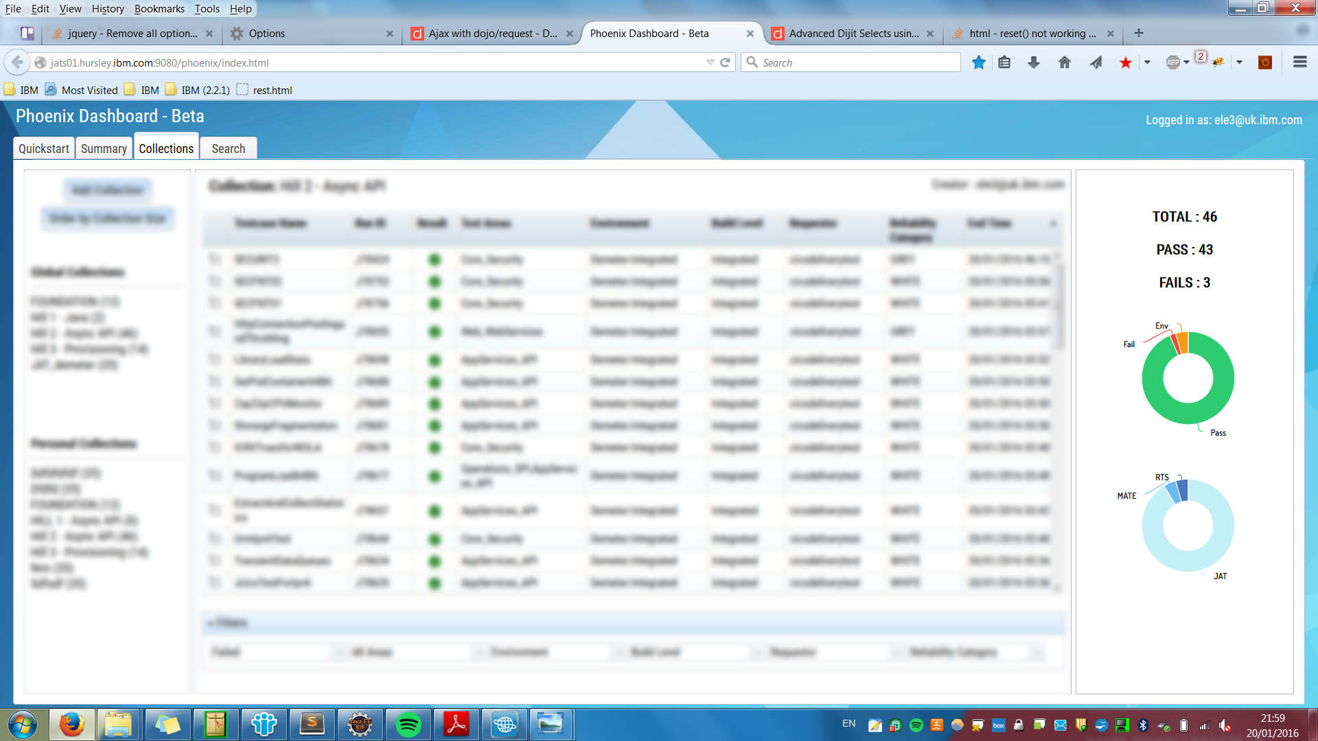
The key feature of the Phoenix Dashboard was the ability to group tests into Collections,
which are made by and unique to the user. This means that the tester can make a collection of
the tests he is responsible for and the manager can create collections of hundreds of tests,
to get an overview of the product!
Results and Impact
The Phoenix UI is now being used by most CICS product managers and testers on a daily basis. Users
can now get visual, critical information about test results as well as insights into patterns
of test results. Time is saved since they no longer need to switch between multiple tools to
find out the results and manually identify problems.
After handover to the team, it has been extended to include bespoke elements of summaries
into the tool and to date, there are over fifty collections being used by the development and
testing team!